Dark Mode Mastery: Color Theory and Accessibility Best Practices
A comprehensive guide to designing accessible dark mode themes, covering color theory, avoiding pure black backgrounds, adjusting saturation for dark contexts, contrast ratios, and developer implementation strategies.
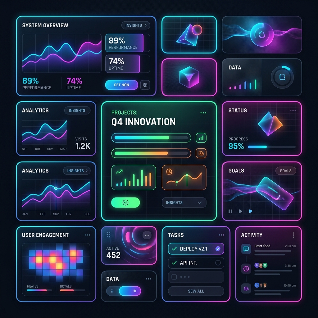
The Dark Mode Mandate
What was once a niche feature for developers and night owls has become an industry standard. Today, users expect a well-crafted dark mode option on every application they interact with. Dark mode reduces eye strain in low-light environments, saves battery life on OLED screens, and offers a sleek, modern aesthetic.
However, creating a great dark mode is not as simple as clicking an "invert colors" button in Figma or CSS. Inverting colors blindly yields terrible results: muddy grays, glowing neon text that burns the retinas, and interfaces that lose all sense of hierarchy and depth.
Designing a premium dark mode requires a deep understanding of color theory, accessibility guidelines (WCAG), and human visual perception.
In this masterclass, we will explore the science of dark mode design and implement a flexible, system-aware dark mode structure.
1. The Chemistry of Dark Mode: Why Pure Black is a Mistake
The most common mistake designers and developers make when implementing a dark theme is setting the background to pure black (#000000) and the body text to pure white (#ffffff).
The Problem with High Contrast
While pure black and white might seem like it provides the highest readability, it actually causes physical eye fatigue and visual distortion:
- Halation Effect: When bright white text is placed on a pitch-black background, the light bleeds over the edges of the letterforms, making the text look blurry or vibrating. This effect is especially pronounced for users with astigmatism (which is roughly 30-40% of the population).
- Stark Contrast: A contrast ratio of 21:1 (pure white on pure black) is too harsh. It forces the iris of the eye to open wider to take in the dark background, but then the extreme brightness of the white text causes discomfort.
The Solution: Use Dark Grays
To prevent halation, use a dark gray or deep, unsaturated blue/slate as your base background color (e.g., #09090b, #121212, or #0f172a). Dark gray absorbs light better and creates a softer canvas for text.
For body text, instead of pure white (#ffffff), use a slightly muted off-white or light gray (e.g., #e4e4e7 or #f4f4f5). This retains excellent legibility while eliminating the harsh glow.
2. Elevation and Depth in the Dark
In light mode, we create depth and hierarchy using shadows. An element that floats above the page casts a dark shadow on the light background underneath.
In dark mode, shadows are virtually invisible because the background is already dark. To communicate depth and elevation in a dark theme, we must use light elevation (making cards lighter as they get closer to the user):
Physical Layer (Top)    -> Button / Dialog  -> Lightest Color (e.g., #27272a)
Floating Layer (Middle) -> Cards / Popovers  -> Mid-range Color (e.g., #18181b)
Base Layer (Bottom)     -> Body Background  -> Darkest Color (e.g., #09090b)
The closer an object is to a light source (which is conceptually located in front of the screen), the more light it reflects. Therefore, components that sit higher in the stack should have a lighter background color than the layers below them.
3. Color Saturation: Desaturate Your Palette
If you use the same vibrant colors from your light theme in your dark theme, they will appear to "glow" or vibrate against the dark background.
Light backgrounds require highly saturated colors to stand out, but dark backgrounds magnify color intensity. To fix this, you must desaturate your brand colors for your dark theme.
The Desaturation Rule of Thumb
- For light mode, you might use a primary blue of
#1d4ed8(HSL:225, 76%, 48%). - For dark mode, you should shift that blue towards a lighter, less saturated variant like
#60a5fa(HSL:213, 93%, 68%) or#3b82f6(HSL:217, 91%, 60%). - Aim to keep HSL Saturation values between 50% and 75% for dark mode accent colors to prevent visual fatigue.
4. Accessibility and Contrast Ratios (WCAG)
To ensure your dark mode is accessible to users with low vision or color vision deficiencies, you must adhere to the Web Content Accessibility Guidelines (WCAG 2.1):
- WCAG AA Level: Normal text must have a minimum contrast ratio of 4.5:1 against its background. Large text (18pt/24px or bold 14pt/18.67px) must have a contrast ratio of 3:1.
- WCAG AAA Level: Normal text must have a minimum contrast ratio of 7:1.
Let’s look at a reference table of contrast values for dark mode:
| Element | Background | Text Color | Contrast Ratio | WCAG Compliance |
|---|---|---|---|---|
| Body Text | #121212 (Base) |
#E4E4E7 (Slate 200) |
13.5:1 | AA & AAA Compliant |
| Secondary Text | #121212 (Base) |
#A1A1AA (Slate 400) |
6.7:1 | AA Compliant |
| Disabled Text | #121212 (Base) |
#52525b (Slate 600) |
2.6:1 | Out of Compliance (Allowed for disabled states only) |
| Primary Button | #3F3F46 (Gray 700) |
#FFFFFF |
4.9:1 | AA Compliant |
5. Technical Implementation: System-Aware Theme Switcher
Let's build a clean, accessible, and system-aware dark mode theme switcher. We will use CSS custom properties (variables) for styling and vanilla JavaScript to handle theme persistence (saving the user's choice in localStorage) and system preferences.
The HTML Structure
<!DOCTYPE html>
<html lang="en" data-theme="system">
<head>
  <meta charset="UTF-8">
  <title>Dark Mode Mastery</title>
  <link rel="stylesheet" href="styles.css">
</head>
<body>
  <header class="app-header">
    <div class="logo">Dark Theme Demo</div>

    <!-- Theme Switcher Widget -->
    <div class="theme-switch-container">
      <button class="theme-toggle-btn" id="theme-toggle" aria-label="Toggle theme">
        <span class="sun-icon">☀️</span>
        <span class="moon-icon">🌙</span>
      </button>
    </div>
  </header>

  <main class="content-wrapper">
    <section class="card elevation-1">
      <h2>Interactive Card</h2>
      <p>This card demonstrates elevation-based coloring in dark mode. It has a slightly lighter background than the page body to simulate depth.</p>

      <div class="button-group">
        <button class="btn btn-primary">Primary Action</button>
        <button class="btn btn-secondary">Cancel</button>
      </div>
    </section>
  </main>

  <script src="theme.js"></script>
</body>
</html>
The CSS (variables and elevations)
/* 1. Theme Variable Definitions */
:root {
  /* Light Theme Variables */
  --bg-body: #ffffff;
  --bg-card: #f4f4f5;
  --border-color: #e4e4e7;

  --text-main: #18181b;
  --text-muted: #71717a;

  --color-primary: #2563eb; /* Saturated Blue */
  --color-primary-hover: #1d4ed8;
  --color-on-primary: #ffffff;

  --color-secondary: #e4e4e7;
  --color-secondary-hover: #d4d4d8;
  --color-on-secondary: #18181b;
}

/* Dark Theme Variables */
[data-theme="dark"] {
  --bg-body: #09090b; /* Deep slate, not pure black */
  --bg-card: #18181b; /* Elevation 1: slightly lighter */
  --border-color: #27272a;

  --text-main: #fafafa; /* Muted off-white */
  --text-muted: #a1a1aa; /* Readable secondary text */

  --color-primary: #3b82f6; /* Desaturated primary blue */
  --color-primary-hover: #60a5fa;
  --color-on-primary: #ffffff;

  --color-secondary: #27272a;
  --color-secondary-hover: #3f3f46;
  --color-on-secondary: #fafafa;
}

/* 2. Global Document Styles */
body {
  background-color: var(--bg-body);
  color: var(--text-main);
  font-family: -apple-system, BlinkMacSystemFont, "Segoe UI", Roboto, sans-serif;
  margin: 0;
  padding: 0;
  transition: background-color 0.3s ease, color 0.3s ease;
}

.app-header {
  display: flex;
  justify-content: space-between;
  align-items: center;
  padding: 20px 40px;
  border-bottom: 1px solid var(--border-color);
}

.content-wrapper {
  max-width: 800px;
  margin: 40px auto;
  padding: 0 20px;
}

/* 3. Elevation/Card Styling */
.card {
  background-color: var(--bg-card);
  border: 1px solid var(--border-color);
  border-radius: 16px;
  padding: 32px;
  transition: background-color 0.3s ease, border-color 0.3s ease;
}

.card h2 {
  margin-top: 0;
}

.card p {
  color: var(--text-muted);
  line-height: 1.6;
}

/* 4. Button Styles */
.button-group {
  display: flex;
  gap: 12px;
  margin-top: 24px;
}

.btn {
  padding: 12px 24px;
  font-weight: 600;
  border-radius: 8px;
  border: none;
  cursor: pointer;
  transition: background-color 0.2s ease, transform 0.1s ease;
}

.btn-primary {
  background-color: var(--color-primary);
  color: var(--color-on-primary);
}

.btn-primary:hover {
  background-color: var(--color-primary-hover);
}

.btn-secondary {
  background-color: var(--color-secondary);
  color: var(--color-on-secondary);
  border: 1px solid var(--border-color);
}

.btn-secondary:hover {
  background-color: var(--color-secondary-hover);
}

/* 5. Theme Toggle Button Logic */
.theme-toggle-btn {
  background: none;
  border: 1px solid var(--border-color);
  padding: 8px;
  border-radius: 50%;
  cursor: pointer;
  width: 40px;
  height: 40px;
  display: flex;
  justify-content: center;
  align-items: center;
  font-size: 18px;
}

/* Hide sun in light, moon in dark */
[data-theme="light"] .sun-icon { display: none; }
[data-theme="dark"] .moon-icon { display: none; }
The JavaScript Theme Controller (theme.js)
document.addEventListener("DOMContentLoaded", () => {
  const themeToggle = document.getElementById("theme-toggle");
  const htmlElement = document.documentElement;

  // Function to calculate and apply theme
  const getSavedTheme = () => {
    const savedTheme = localStorage.getItem("theme");
    if (savedTheme) {
      return savedTheme;
    }
    // Fallback to system preference
    return window.matchMedia("(prefers-color-scheme: dark)").matches ? "dark" : "light";
  };

  const applyTheme = (theme) => {
    htmlElement.setAttribute("data-theme", theme);
    localStorage.setItem("theme", theme);
  };

  // Initial application of theme
  let currentTheme = getSavedTheme();
  applyTheme(currentTheme);

  // Toggle Theme Button Handler
  themeToggle.addEventListener("click", () => {
    currentTheme = htmlElement.getAttribute("data-theme") === "dark" ? "light" : "dark";
    applyTheme(currentTheme);
  });

  // Listen for operating system theme switches in real-time
  window.matchMedia("(prefers-color-scheme: dark)").addEventListener("change", (e) => {
    // Only update if user hasn't explicitly set a preference
    if (!localStorage.getItem("theme")) {
      const newSystemTheme = e.matches ? "dark" : "light";
      applyTheme(newSystemTheme);
    }
  });
});
Conclusion: Crafting Comfort for the Dark
Designing a successful dark mode is a balance of aesthetics, color math, and accessibility. By steering clear of raw black and white, scaling your component colors using light elevation, and desaturating accent tones, you ensure your interface is comfortable and readable. By pairing these choices with a robust, system-aware implementation, you give users control over their visual environment, elevating their overall experience.
Creating a flawless dark mode demonstrates that you respect your users' eyes, battery life, and environments. Make accessibility your foundation, test your contrast ratios rigorously, and build digital spaces that are comfortable to experience—day or night.