Micro-Interactions that Delight: Adding Polish to Your Web Apps
A comprehensive guide on micro-interactions in web design, outlining their psychological impact, and providing practical, step-by-step code tutorials to implement high-quality, lightweight animations.
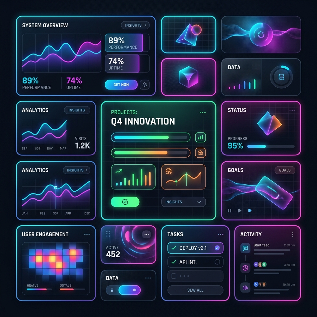
The Difference Between Good and Great Software
Have you ever clicked a button and felt an immediate, satisfying sense of completion? Or loaded a page and watched a progress bar slide smoothly, making the wait feel like a blink?
These small details are micro-interactions. Popularized by designer Dan Saffer, a micro-interaction is a single, task-focused moment in a user interface. They are the subtle animations, transitions, and sensory feedbacks that occur when you toggle a switch, pull to refresh, search a list, or like a post.
While macro-interactions structure the main flows of your application (like onboarding or completing a purchase), micro-interactions provide the polish. They are the difference between an application that feels like a static utility and one that feels responsive, organic, and alive.
In this guide, we will analyze the anatomy of micro-interactions, study the physics of natural UI motion, and code three production-ready micro-interactions using HTML and CSS.
The Four Pillars of a Micro-Interaction
Every successful micro-interaction consists of four essential stages:
[ Trigger ] ---> [ Rules ] ---> [ Feedback ] ---> [ Loops & Modes ]
- Trigger: The event that initiates the micro-interaction. This can be user-initiated (clicking a button, hovering over a card, scrolling down) or system-initiated (receiving a push notification, completing a download).
- Rules: The invisible logic of the interaction. What happens when the trigger fires? For example, when hovering over a button, the rule might state: "Scale up by 5% and shift background color over 200ms."
- Feedback: How the user perceives the rules in action. This is the visual change, the sound effect, or the haptic buzz on a phone. Feedback helps users build a mental model of how the system works.
- Loops & Modes: The operational parameters. Does the interaction repeat? (e.g., a loading spinner loops until the action completes). How does it change when the mode shifts? (e.g., toggle button changes color to indicate "On" vs "Off").
The Physics of Natural Motion: Easing
The quickest way to make a web app feel cheap is using linear animations. In the physical world, objects do not start moving at full speed instantly and stop on a dime. They accelerate and decelerate due to friction, gravity, and mass.
To replicate physical weight and momentum in your UI, you must use easing functions (cubic beziers) instead of linear transitions:
- Avoid:
transition: all 0.2s linear; - Use instead:
transition: all 0.3s cubic-bezier(0.25, 0.8, 0.25, 1);(Ease Out - starts fast, decelerates gracefully). - For playful elements:
transition: all 0.4s cubic-bezier(0.34, 1.56, 0.64, 1);(Back Out - overshoot bounce effect).
The Golden Rules of UI Motion Timing
- Hover/Feedback Animations: Keep these fast, between 100ms and 200ms. Anything longer makes the interface feel laggy or heavy.
- Page Transitions & Large Elements: Keep these between 300ms and 450ms to give the user enough time to track the motion without wasting their time.
3 Essential Micro-Interactions to Elevate Your UI
Let’s implement three highly polished, accessible micro-interactions using clean HTML and CSS.
1. The Elastic Button Press
This button uses a subtle scale-down effect on active click and a soft border-glow on hover, creating the physical sensation of pressing a tactile spring.
<button class="interactive-btn">
  <span class="btn-text">Confirm Transaction</span>
  <span class="btn-icon">💳</span>
</button>
.interactive-btn {
  display: inline-flex;
  align-items: center;
  gap: 12px;
  padding: 14px 28px;
  border-radius: 12px;
  border: 1px solid rgba(255, 255, 255, 0.1);
  background: #1e1b4b;
  color: #c7d2fe;
  font-weight: 600;
  cursor: pointer;

  /* Smooth transition using an elastic Out curve */
  transition:
    background-color 0.2s ease,
    transform 0.3s cubic-bezier(0.34, 1.56, 0.64, 1),
    box-shadow 0.3s ease;
}

.interactive-btn:hover {
  background: #312e81;
  color: #ffffff;
  transform: translateY(-2px) scale(1.02);
  box-shadow: 0 8px 24px rgba(99, 102, 241, 0.3);
}

/* Tactile press feedback */
.interactive-btn:active {
  transform: translateY(1px) scale(0.96);
  box-shadow: 0 2px 8px rgba(99, 102, 241, 0.1);
}

.btn-icon {
  transition: transform 0.3s cubic-bezier(0.34, 1.56, 0.64, 1);
}

.interactive-btn:hover .btn-icon {
  transform: translateX(4px) rotate(-10deg);
}
2. The Smart Floating Label Input
When a user focuses on a text input, the placeholder label morphs, shrinks, and floats above the input path, indicating that the input is active and ready for data entry.
<div class="floating-input-group">
  <input type="text" id="username" class="floating-input" placeholder=" " required>
  <label for="username" class="floating-label">Email Address</label>
  <span class="focus-border-line"></span>
</div>
.floating-input-group {
  position: relative;
  margin-bottom: 24px;
  width: 100%;
  max-width: 360px;
}

.floating-input {
  width: 100%;
  padding: 16px 12px 8px 12px;
  border: 2px solid #3f3f46;
  border-radius: 8px;
  background: transparent;
  color: #ffffff;
  font-size: 16px;
  outline: none;
  box-sizing: border-box;
  transition: border-color 0.2s ease;
}

.floating-label {
  position: absolute;
  left: 12px;
  top: 50%;
  transform: translateY(-50%);
  color: #a1a1aa;
  pointer-events: none;
  transition: all 0.25s cubic-bezier(0.25, 0.8, 0.25, 1);
  font-size: 16px;
}

/* Floating effect triggered on focus OR when the input has content */
.floating-input:focus ~ .floating-label,
.floating-input:not(:placeholder-shown) ~ .floating-label {
  top: 0;
  transform: translateY(-50%) scale(0.85);
  background-color: #09090b; /* Matches your background to cover the border line */
  padding: 0 6px;
  color: #6366f1;
}

.floating-input:focus {
  border-color: #6366f1;
}
3. The Animated Switch Toggle
A toggle switch that slides, changes state colors, and stretches the handle slightly during the transition, replicating the behavior of high-end iOS switches.
<label class="switch-toggle">
  <input type="checkbox" class="toggle-checkbox">
  <span class="toggle-track">
    <span class="toggle-handle"></span>
  </span>
</label>
.switch-toggle {
  display: inline-block;
  width: 56px;
  height: 32px;
  position: relative;
  cursor: pointer;
}

.toggle-checkbox {
  opacity: 0;
  width: 0;
  height: 0;
}

.toggle-track {
  position: absolute;
  top: 0; left: 0; right: 0; bottom: 0;
  background-color: #3f3f46;
  border-radius: 32px;
  transition: background-color 0.3s ease;
}

.toggle-handle {
  position: absolute;
  content: "";
  height: 24px;
  width: 24px;
  left: 4px;
  bottom: 4px;
  background-color: white;
  border-radius: 50%;

  /* Spring transition for toggle sliding */
  transition: transform 0.3s cubic-bezier(0.34, 1.56, 0.64, 1), width 0.2s ease;
}

/* Active Track Color Change */
.toggle-checkbox:checked + .toggle-track {
  background-color: #10b981;
}

/* Sliding animation */
.toggle-checkbox:checked + .toggle-track .toggle-handle {
  transform: translateX(24px);
}

/* Tactile stretch effect on drag/press */
.switch-toggle:active .toggle-handle {
  width: 30px; /* Slightly expands horizontal shape */
}

.toggle-checkbox:checked:active + .toggle-track .toggle-handle {
  transform: translateX(18px); /* Adjust position back to compensate for stretching */
}
When to Stop: The Danger of Over-Animation
While micro-interactions can delight users, too much animation will destroy the user experience. If every link, icon, and text block on your page rotates, bounces, or slides, your website will feel unstable, distracting, and slow.
Follow these rules of restraint:
- Don't block the user: Never force a user to wait for an animation to finish before they can proceed. If your menu takes 1.5 seconds to slide out before they can click a link, it is a bad user experience.
- Maintain Accessibility: Ensure that users who prefer reduced motion (detected via the CSS media query
@media (prefers-reduced-motion: reduce)) receive static transitions. - Iterate and test: If a micro-interaction becomes annoying after using it fifty times, it should be simplified.
Conclusion
Micro-interactions are the silent ambassadors of your brand. They show your users that you care about detail, craftsmanship, and their interaction comfort. By designing with clear rules, choosing natural easing curves, and keeping interactions fast and unobtrusive, you can elevate your application from functional to memorable.
Go through your current web project today: check your buttons, inputs, and state changes. Swap out linear ease rules with organic cubic beziers and watch the entire digital experience come alive.