Bento Box UI: Why It's Everywhere and How to Design It
An in-depth guide to Bento Box UI, tracing its origins, analyzing why it has become the dominant design trend, and providing a step-by-step framework to design responsive, grid-based layouts with CSS Grid and Flexbox.
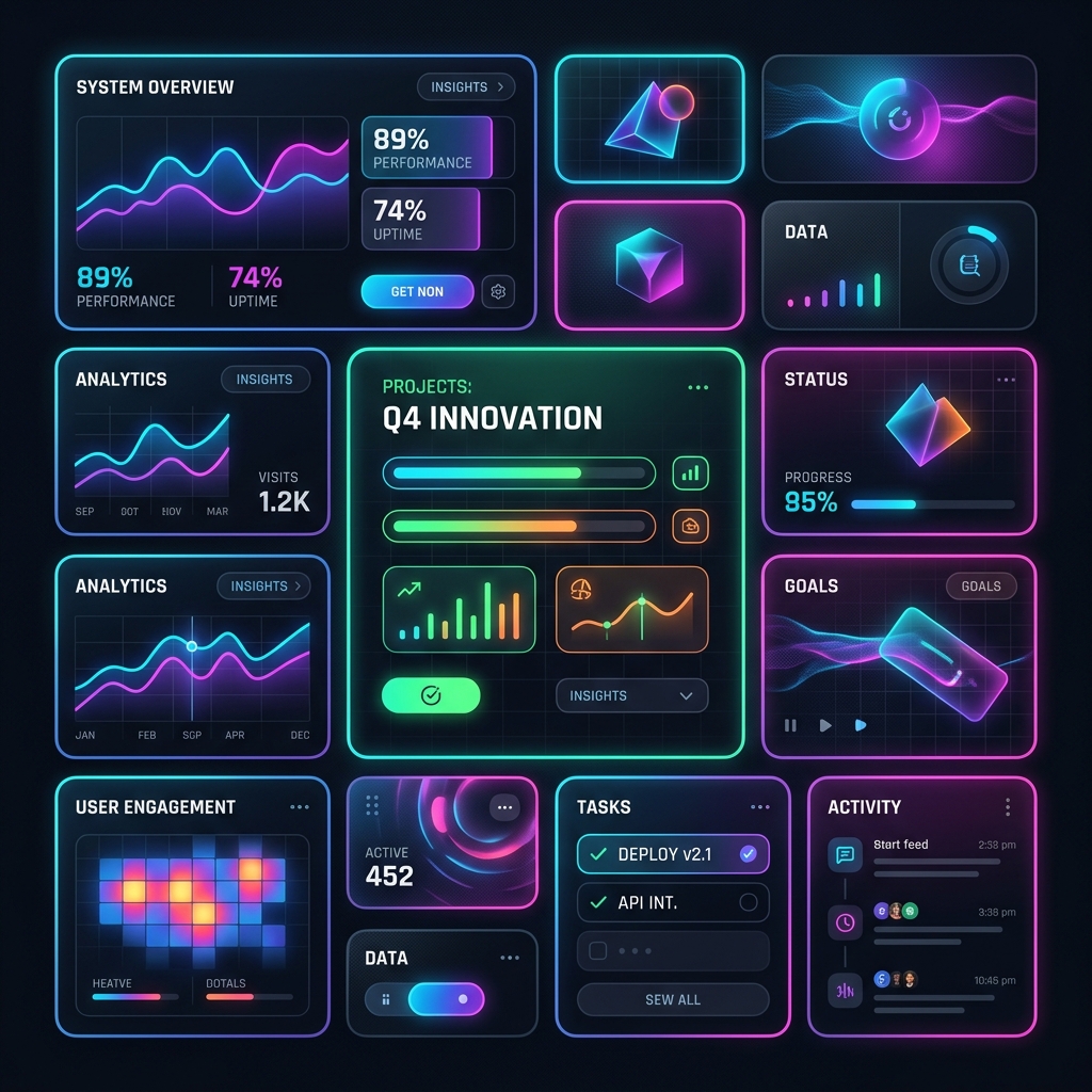
The Rise of the Bento Box UI
Walk through any modern design showcase, visit Apple’s landing pages, or browse SaaS dashboards, and you will spot a recurring pattern: information structured into clean, rounded, grid-based compartments. This layout style is affectionately known as the Bento Box UI. Inspired by the traditional Japanese bento lunchbox, which separates different foods into individual, tidy compartments, Bento Box UI does the same for content. It chunks diverse pieces of information into a cohesive, highly scannable, and visually striking grid.
But Bento Box UI is more than just a passing aesthetic fad. It solves a fundamental problem in modern user experience design: how do we present a high density of varied information without overwhelming the user?
In this comprehensive guide, we will analyze the history and psychology behind Bento Box UI, examine the core design principles that make it work, and build a production-ready, responsive Bento Grid using modern CSS.
Why Bento Box UI Has Captured the Industry
To understand why this layout has become the default choice for landing pages, portfolios, and dashboard interfaces, we must look at both its functional utility and its psychological benefits.
1. Superior Information Scannability
Human beings process visual boundaries efficiently. By placing text, images, and data inside distinct "cards" or "boxes," you create explicit container boundaries. This containerization leverages the Gestalt principle of Common Region, which states that elements located within the same closed region are perceived as a group. Users can parse the page in a fraction of a second, deciding which box to read next based on its size, color, or visual weight.
2. High-Density Content Delivery
Traditional layouts often restrict content to uniform columns or linear stacks, resulting in a lot of wasted space or extremely long scroll depths. Bento UI allows you to pack stats, illustrations, call-to-actions, testimonials, and features into a single viewport. It turns a standard page section into an interactive billboard of your product's capabilities.
3. Native Responsiveness
Because Bento grids are built on mathematical grid systems, they are incredibly easy to adapt to different screen sizes. A 4-column layout on a wide desktop screen can gracefully collapse into a 2-column layout on a tablet, and a single-column stack on a mobile phone, all while preserving the integrity of individual content cards.
4. Modular Flexibility
With Bento UI, you can treat your layout like Lego bricks. If you need to swap a testimonial for a new product video, you only need to change the content within that specific box. The surrounding grid remains stable, reducing the risk of layout reflows or broken styling.
Core Design Principles of Bento UI
Designing a successful Bento Grid is not just about placing random rectangles on a page. Without a clear set of design rules, Bento layouts can easily devolve into visual chaos. Here are the core principles to follow:
1. Establish Visual Hierarchy
Not all boxes should be created equal. The size of each card must reflect its importance.
- Hero Box (2x2 or 3x2 Grid Span): This is your primary focus area. It should contain your value proposition, a key screenshot, or your main call to action.
- Secondary Cards (1x2 or 2x1 Grid Span): These hold supporting features, key metrics, or secondary visual assets.
- Micro-Cards (1x1 Grid Span): Best for small details, like social media icons, status indicators, or single statistics.
2. Respect the Grid Gap and Padding
Consistency is the secret ingredient of Bento UI.
- Use a uniform gap between your cards (e.g.,
16pxor24px). - Ensure the inner padding of each card is equal to or slightly larger than the grid gap. If your grid gap is
20px, your card inner padding should ideally be24pxto32pxto give the contents breathing room.
3. Maintain Consistent Border Radii
Bento layouts rely heavily on rounded corners to soften the grid structure.
- Use a generous border-radius for the cards (typically between
16pxand32px). - Pro-tip: If your cards have nested elements (like inner buttons or image containers) that also have borders, remember to calculate nested border radii mathematically:
$$\text{Inner Radius} = \text{Outer Radius} - \text{Padding}$$
If your card has an outer radius of
24pxand padding of16px, your inner element should have a border-radius of8pxto maintain visual harmony.
4. Limit Visual Noise
Because you are presenting multiple concepts simultaneously, keep individual card designs clean. Avoid busy background patterns. Instead, use solid, high-contrast background colors, subtle glassmorphic effects, or clean gradients. Use a single typography scale across all boxes.
Building a Responsive Bento Grid: A Practical Implementation
Let's translate these design principles into clean, semantic HTML and CSS. We will build a feature showcase Bento Grid that adapts seamlessly across mobile, tablet, and desktop screens using CSS Grid.
The HTML Structure
<section class="bento-section">
<div class="bento-container">
<!-- Hero / Main Feature Card -->
<article class="bento-card bento-hero">
<div class="card-content">
<span class="badge">New Release</span>
<h3>Next-Gen Analytics Engine</h3>
<p>Analyze millions of data points in real time with our newly optimized distributed processing pipeline.</p>
<a href="#" class="cta-button">Explore Analytics →</a>
</div>
<div class="card-visual hero-visual">
<!-- Visual asset or interactive chart goes here -->
<div class="mock-chart">
<div class="bar" style="height: 40%"></div>
<div class="bar" style="height: 65%"></div>
<div class="bar" style="height: 50%"></div>
<div class="bar" style="height: 85%"></div>
<div class="bar" style="height: 100%"></div>
</div>
</div>
</article>
<!-- Stat Card -->
<article class="bento-card bento-stat">
<p class="stat-label">System Uptime</p>
<h4 class="stat-value">99.99%</h4>
<p class="stat-subtext">Enterprise-grade reliability guaranteed by our multi-region failover protocol.</p>
</article>
<!-- Integration Card -->
<article class="bento-card bento-integration">
<h3>Seamless Integrations</h3>
<div class="logo-cloud">
<span class="logo-icon">⚡</span>
<span class="logo-icon">🔥</span>
<span class="logo-icon">💎</span>
<span class="logo-icon">🚀</span>
</div>
<p>Connect with your favorite developer tools in a single click.</p>
</article>
<!-- Feature highlight -->
<article class="bento-card bento-security">
<div class="card-content">
<h3>End-to-End Security</h3>
<p>AES-256 encryption at rest and TLS 1.3 in transit keep your proprietary data secure.</p>
</div>
<span class="shield-badge">🔒 Secure</span>
</article>
<!-- Micro interactive card -->
<article class="bento-card bento-interactive">
<div class="card-content">
<h3>Dark Mode</h3>
<p>Switch between light and dark themes effortlessly.</p>
<button class="theme-toggle-btn">Toggle Theme</button>
</div>
</article>
</div>
</section>
The CSS Stylesheet
/* Base Resets & Layout Setup */
:root {
  --bg-primary: #09090b;
  --card-bg: #18181b;
  --card-border: #27272a;
  --text-primary: #fafafa;
  --text-secondary: #a1a1aa;
  --accent-color: #6366f1;
  --card-padding: 24px;
  --grid-gap: 20px;
  --outer-radius: 24px;
}

body {
  background-color: var(--bg-primary);
  color: var(--text-primary);
  font-family: -apple-system, BlinkMacSystemFont, "Segoe UI", Roboto, sans-serif;
  margin: 0;
  padding: 40px 20px;
}

.bento-section {
  max-width: 1200px;
  margin: 0 auto;
}

/* Bento Grid System */
.bento-container {
  display: grid;
  grid-template-columns: repeat(4, 1fr);
  grid-gap: var(--grid-gap);
  grid-auto-rows: minmax(220px, auto);
}

/* Card Styling */
.bento-card {
  background-color: var(--card-bg);
  border: 1px solid var(--card-border);
  border-radius: var(--outer-radius);
  padding: var(--card-padding);
  display: flex;
  flex-direction: column;
  justify-content: space-between;
  position: relative;
  overflow: hidden;
  transition: transform 0.3s cubic-bezier(0.25, 0.8, 0.25, 1),
              border-color 0.3s ease,
              box-shadow 0.3s ease;
}

.bento-card:hover {
  transform: translateY(-4px);
  border-color: var(--accent-color);
  box-shadow: 0 12px 30px rgba(99, 102, 241, 0.15);
}

/* Customizing Individual Card Spans */
.bento-hero {
  grid-column: span 3;
  grid-row: span 2;
  flex-direction: row;
  align-items: center;
  background: radial-gradient(circle at 100% 100%, rgba(99, 102, 241, 0.15) 0%, transparent 60%), var(--card-bg);
}

.bento-stat {
  grid-column: span 1;
  grid-row: span 1;
  background-color: #0f172a;
  border-color: #1e293b;
}

.bento-integration {
  grid-column: span 1;
  grid-row: span 2;
}

.bento-security {
  grid-column: span 2;
  grid-row: span 1;
  flex-direction: row;
  align-items: center;
}

.bento-interactive {
  grid-column: span 1;
  grid-row: span 1;
}

/* Content Element Styling */
.bento-card h3 {
  margin: 0 0 10px 0;
  font-size: 1.5rem;
  font-weight: 600;
  letter-spacing: -0.02em;
}

.bento-card p {
  color: var(--text-secondary);
  font-size: 0.95rem;
  line-height: 1.5;
  margin: 0;
}

/* Custom Visual Elements inside Bento Grid */
.hero-visual {
  flex: 1;
  display: flex;
  justify-content: center;
  align-items: flex-end;
  height: 100%;
  padding-left: 20px;
}

.mock-chart {
  display: flex;
  align-items: flex-end;
  gap: 8px;
  width: 100%;
  height: 150px;
  background: rgba(255, 255, 255, 0.03);
  padding: 16px;
  border-radius: 12px;
  border: 1px dashed var(--card-border);
}

.mock-chart .bar {
  flex: 1;
  background: var(--accent-color);
  border-radius: 4px;
  transition: height 0.5s ease-out;
}

/* Stat Card styling */
.stat-value {
  font-size: 3rem;
  font-weight: 800;
  margin: 10px 0;
  color: var(--accent-color);
  letter-spacing: -0.03em;
}

.stat-label {
  text-transform: uppercase;
  font-size: 0.75rem;
  letter-spacing: 0.05em;
}

/* Responsive Breakpoints */
@media (max-width: 1024px) {
  .bento-container {
    grid-template-columns: repeat(2, 1fr);
  }

  .bento-hero {
    grid-column: span 2;
    flex-direction: column;
    align-items: flex-start;
  }

  .bento-security {
    grid-column: span 2;
  }
}

@media (max-width: 640px) {
  .bento-container {
    grid-template-columns: 1fr;
    grid-auto-rows: auto;
  }

  .bento-hero,
  .bento-stat,
  .bento-integration,
  .bento-security,
  .bento-interactive {
    grid-column: span 1;
    grid-row: span 1;
  }

  .bento-hero {
    flex-direction: column;
  }

  .hero-visual {
    padding-left: 0;
    padding-top: 20px;
    width: 100%;
  }
}
When NOT to Use a Bento Grid
While Bento Box UI is incredibly powerful, it is not a silver bullet. You should avoid using a Bento layout in the following circumstances:
- Linear Storytelling: If your content relies on a strict narrative order where step A must be read before step B, a Bento Grid will disrupt that flow. Users read Bento grids non-linearly.
- Dense Tabular Data: Financial records, detailed logs, or database rows belong in searchable, filterable tables, not card layouts.
- Extremely Uniform Content: If all your features or items have the exact same level of detail, dimensions, and importance, a standard 3-column feature grid is more appropriate than trying to force varied dimensions.
Final Thoughts
Bento Box UI has redefined digital layout systems by introducing modular, responsive, and highly engaging containment. By establishing clear visual hierarchies, respecting whitespace boundaries, and writing flexible CSS Grid components, you can craft beautiful dashboard structures that make complex data feel approachable and engaging.
Give Bento UI a try on your next portfolio or landing page layout—your users will appreciate the structure, scannability, and elegance.